
前言
本文具有强烈的个人感情色彩,如有观看不适,请尽快关闭. 本文仅作为个人学习记录使用,也欢迎在许可协议范围内转载或分享,请尊重版权并且保留原文链接,谢谢您的理解合作. 如果您觉得本站对您能有帮助,您可以使用RSS方式订阅本站,感谢支持!.
以下内容是学习记录
DevEco Studio快捷键
| 快捷键 | 用途 | 备注 |
|---|---|---|
⌘(Command) + B | 进入到类或者对象的定义文件中中 | 类似Xcode中的 ⌘(Command) + → |
| ⌘(Command) + ⇧(Shift) + ⌫(Back) | 与上面相反,返回上一级 | 类似Xcode中的 ⌘(Command) + ← |
在看过几遍鸿蒙教程视频和文档后,我觉得把容易遗忘的基础都记录下来,以备后续使用的时候随时查找.
ArkTS基础部分
页面和自定义组件组成生命周期
首先我们要了解一下一个组件是组成UI的基本单元,我们要明确自定义组件和页面的关系
- 自定义组件:
@Component装饰的UI单元,可以组合多个系统组件实现UI的复用,可以调用组件的生命周期。 - 页面:即应用的UI页面。可以由一个或者多个自定义组件组成,@Entry装饰的自定义组件为页面的入口组件,即页面的根节点,一个页面有且仅能有一个@Entry。只有被@Entry装饰的组件才可以调用页面的生命周期。
1
2
3
4
5
6
7
@Entry
@Component
struct LiftCycle {
  build() {
   	...
   }
}
- struct:自定义组件基于struct实现,struct + 自定义组件名 + {…}的组合构成自定义组件,不能有继承关系。对于struct的实例化,可以省略new (自定义组件名、类名、函数名不能和系统组件名相同。)
- @Component:@Component装饰器仅能装饰struct关键字声明的数据结构。struct被@Component装饰后具备组件化的能力,需要实现build方法描述UI,一个struct只能被一个@Component装饰。(从API version 9开始,该装饰器支持在ArkTS卡片中使用。)
- build()函数:build()函数用于定义自定义组件的声明式UI描述,自定义组件必须定义build()函数。
- @Entry:@Entry装饰的自定义组件将作为UI页面的入口。在单个UI页面中,最多可以使用@Entry装饰一个自定义组件。@Entry可以接受一个可选的LocalStorage的参数。
从API version 9开始,该装饰器支持在ArkTS卡片中使用。
从API version 10开始,@Entry可以接受一个可选的LocalStorage的参数或者一个可选的EntryOptions参数。
EntryOptions10+
命名路由跳转选项
| 名称 | 类型 | 必填 | 说明 |
|---|---|---|---|
| routeName | string | 否 | 表示作为命名路由页面的名字。 |
| storage | LocalStorage | 否 | 页面级的UI状态存储。 |
1
2
3
4
5
@Entry({ routeName : 'myPage' })
@Component
struct MyComponent {

}
- @Reusable:@Reusable装饰的自定义组件具备可复用能力
1
2
3
4
@Reusable
@Component
struct MyComponent {
}
从API version 10开始,该装饰器支持在ArkTS卡片中使用。
页面和组件的生命周期
被?@Entry装饰的组件生命周期,提供以下生命周期接口:
onPageShow:页面每次显示时触发一次,包括路由过程、应用进入前台等场景,仅@Entry装饰的自定义组件生效。onPageHide:页面每次隐藏时触发一次,包括路由过程、应用进入后台等场景,仅@Entry装饰的自定义组件生效。onBackPress:当用户点击返回按钮时触发,仅@Entry装饰的自定义组件生效。
//被@Entry装饰的组件 的生命周期 代码如下演示
1
2
3
4
5
6
7
8
9
10
11
12
13
//页面每次显示的时候被触发
onPageShow(): void {
	console.log("LiftCycle onPageShow")
}

//页面每次隐藏的时候被触发
onPageHide(): void {
	console.log("LiftCycle onPageHide")
}
//点击返回按钮时触发
onBackPress(): boolean | void {
	console.log("LiftCycle onBackPress")
}
组件生命周期,即一般用@Component装饰的自定义组件的生命周期,提供以下生命周期接口:
aboutToAppear:组件即将出现时回调该接口,具体时机为在创建自定义组件的新实例后,在执行其build()函数之前执行。aboutToDisappear:aboutToDisappear函数在自定义组件析构销毁之前执行。不允许在aboutToDisappear函数中改变状态变量,特别是@Link变量的修改可能会导致应用程序行为不稳定
1
2
3
4
5
6
7
8
//被@Component修饰的 自定义组件的生命周期
aboutToAppear(): void {
	console.log("LiftCycle aboutToAppear")
}

aboutToDisappear(): void {
	console.log("LiftCycle aboutToDisappear")
}
生命周期流程如下图所示,下图展示的是被@Entry装饰的组件(首页)生命周期。

**由此可知, @Component组件的声明周期方法 中间包含了@Entry方法全部生命周期方法调用.
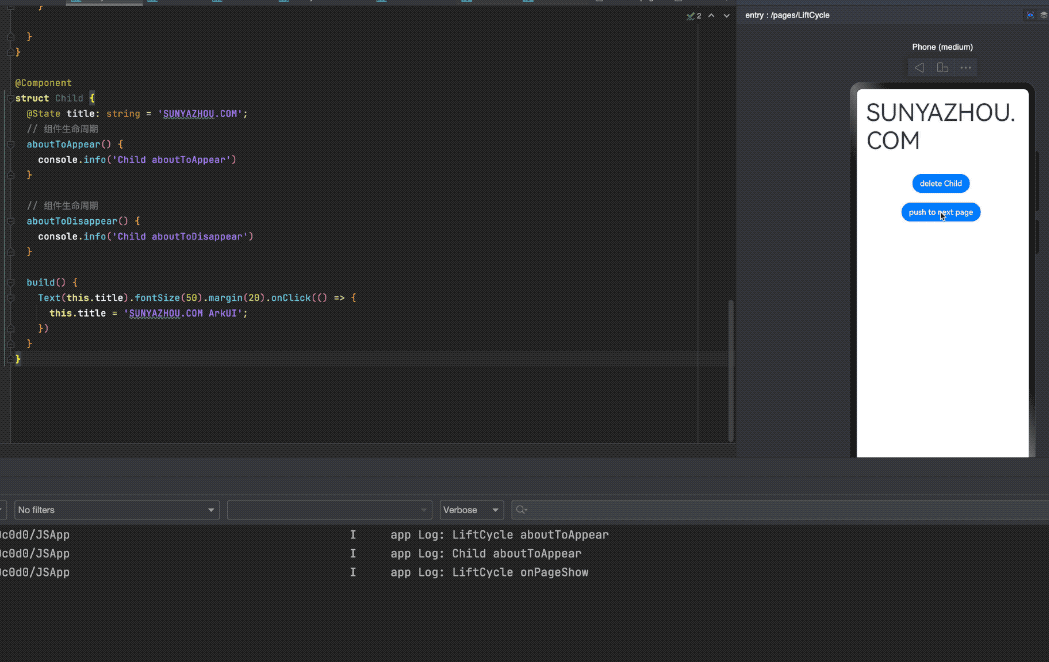
示例代码演示了一个LifeCycle中 添加一个Child子组件,点击按钮push到新页面LifeCycleDetail
1
2
3
4
5
6
7
8
9
10
11
12
13
14
15
16
17
18
19
20
21
22
23
24
25
26
27
28
29
30
31
32
33
34
35
36
37
38
39
40
41
42
43
44
45
46
47
48
49
50
51
52
53
54
55
56
57
58
59
60
61
62
63
64
65
66
67
68
69
70
71
72
73
74
75
76
77
// LiftCycle.ets
import router from '@ohos.router';

@Entry
@Component
struct LiftCycle {
  @State showChild: boolean = true;
  @State btnColor:string = "#FF007DFF"

  // 组件生命周期
  aboutToAppear() {
    console.info('LiftCycle aboutToAppear');
  }

  // 只有被@Entry装饰的组件才可以调用页面的生命周期
  onPageShow() {
    console.info('LiftCycle onPageShow');
  }
  // 只有被@Entry装饰的组件才可以调用页面的生命周期
  onPageHide() {
    console.info('LiftCycle onPageHide');
  }

  // 只有被@Entry装饰的组件才可以调用页面的生命周期
  onBackPress() {
    console.info('LiftCycle onBackPress');
    this.btnColor ="#FFEE0606"
    return true // 返回true表示页面自己处理返回逻辑,不进行页面路由;返回false表示使用默认的路由返回逻辑,不设置返回值按照false处理
  }

  // 组件生命周期
  aboutToDisappear() {
    console.info('LiftCycle aboutToDisappear');
  }

  build() {
    Column() {
      // this.showChild为true,创建Child子组件,执行Child aboutToAppear
      if (this.showChild) {
        Child()
      }
      // this.showChild为false,删除Child子组件,执行Child aboutToDisappear
      Button('delete Child')
        .margin(20)
        .backgroundColor(this.btnColor)
        .onClick(() => {
          this.showChild = false;
        })
      // push到page页面,执行onPageHide
      Button('push to next page')
        .onClick(() => {
          router.pushUrl({ url: 'pages/LifeCycleDetail' });
        })
    }

  }
}

@Component
struct Child {
  @State title: string = 'SUNYAZHOU.COM';
  // 组件生命周期
  aboutToAppear() {
    console.info('Child aboutToAppear')
  }

  // 组件生命周期
  aboutToDisappear() {
    console.info('Child aboutToDisappear')
  }

  build() {
    Text(this.title).fontSize(50).margin(20).onClick(() => {
      this.title = 'SUNYAZHOU.COM ArkUI';
    })
  }
}
LifeCycleDetail代码如下
1
2
3
4
5
6
7
8
9
10
11
12
13
14
15
16
17
18
19
20
21
22
23
24
25
26
27
28
29
30
31
32
33
34
35
36
37
38
39
@Entry
@Component
struct LifeCycleDetail {
  @State textColor: Color = Color.Black;
  @State num: number = 0

  onPageShow() {
    this.num = 5
    console.log("LifeCycleDetail onPageShow");
  }

  onPageHide() {
    console.log("LifeCycleDetail onPageHide");
  }

  onBackPress() { // 不设置返回值按照false处理
    this.textColor = Color.Grey
    this.num = 0
    console.log("LifeCycleDetail onBackPress");
  }

  aboutToAppear() {
    this.textColor = Color.Blue
  }

  build() {
    Column() {
      Text(`num 的值为:${this.num}`)
        .fontSize(30)
        .fontWeight(FontWeight.Bold)
        .fontColor(this.textColor)
        .margin(20)
        .onClick(() => {
          this.num += 5
        })
    }
    .width('100%')
  }
}
当我们启动预览的时候声明周期函数如下:
1
2
3
app Log: LiftCycle aboutToAppear
app Log: Child aboutToAppear
app Log: LiftCycle onPageShow
当我们点击Push的时候
1
2
app Log: LiftCycle onPageHide
app Log: LifeCycleDetail onPageShow
点击返回的时候
1
2
3
LifeCycleDetail onBackPress
LifeCycleDetail onPageHide
LiftCycle onPageShow
删除 Child的时候
1
app Log: Child aboutToDisappear
基础类型和函数方法
1
2
3
4
5
6
7
8
9
10
11
12
13
14
15
16
17
18
19
20
21
22
23
24
25
26
27
28
29
30
31
32
33
34
35
36
let number1: number = 99 // 默认情况下 正常情况下给的数字 就是十进制的哦
let number2: number = 0b10011 // 2进制 由0b开头的
let number3: number = 0o1234567 // 8进制 由0o开头的
let number4: number = 0x6464ab // 16进制 由日x开头的

// TODO 字符串
let string1: string = 'sunyazhou'
let string2: string = "sunyazhou"
let string3:string = "你的名字是: ${string2}"

// TODO 联合类型、 布尔 真ture/假false
let objectType : string | number | boolean
objectType = true
objectType = "sunyazhou"
objectType = 635464
objectType = false

// TODO 数组
let stringArray1: Array<string> = ['AAA','BBB','CCC']; //0下标开始的
let stringArray2: string[] = ['AAA','BBB','CCC'];

// TODO 枚举
enum Color {Red, Green, Yellow};
let color: Color = Color.Red;

// TODO 元组 和swift中的元组一样,可以理解为多类型的字典,key都是字符串 value是不同的数据类型
let name1:[string, number];
name1 = [@"孙先生", 20]; //必须按照规定顺序和类型写内容

// TODO void 无返回类型型
function name(params): void {}

// Null
let str1: null = null
// undefined
let str2: undefined = undefined
作用域范围
1
2
3
4
5
6
7
8
9
10
11
12
13
14
15
16
17
18
19
20
@Entry
@Component
struct LearnDetail {
  @State message: string = 'Hello World';

  // 里面不加let,外面的成员需要加let
  number1: number = 99

  build() {
    Row() {
      Column() {
        Text(this.message)
          .fontSize(50)
          .fontWeight(FontWeight.Bold)
      }
      .width('100%')
    }
    .height('100%')
  }
}
ArkUI部分
图片控件
加载 常规本地资源
1
Image($r(app.media.icon))
加载 网络资源
1
Image("https://www.sunyazhou.com/assets/images/20240116HarmonyPhoneSendFileTomacOS/harmonyOS.webp")
加载 本地任何资源
1
Image($rawfile("sunyazhou.png"))
装饰器@Styles
@Styles装饰器可以将多条样式设置提炼成一个方法,直接在组件声明的位置调用。通过@Styles装饰器可以快速定义并复用自定义样式。用于快速定义并复用自定义样式.
- 当前@Styles仅支持通用属性和通用事件。
- @Styles方法不支持参数
从API version 9开始,该装饰器支持在ArkTS卡片中使用。
使用全局的@Styles封装的样式
1
2
3
4
5
@Styles function globalStyles() {
  .width(150)
  .height(300)
  .backgroundColor(Color.Pink)
}
定义在组件内的@Styles封装的样式
1
2
3
4
5
6
7
8
9
10
11
12
13
14
15
16
struct LearnDetail {
  @State heightValue: number = 100
  // 定义在组件内的@Styles封装的样式
  @Styles innerStyle() {
    .width(200)
    .height(this.heightValue)
    .backgroundColor(Color.Yellow)
    .onClick(() => {
      this.heightValue = 200
    })
  }

  build() {
    ...
  }
}
如何使用
1
2
3
4
5
6
7
8
9
10
11
12
13
14
15
16
17
18
19
20
21
22
23
24
25
26
27
28
29
30
31
32
33
34
35
36
37
@Entry
@Component
struct LearnDetail {
  @State heightValue: number = 100
  // 定义在组件内的@Styles封装的样式
  @Styles innerStyle() {
    .width(200)
    .height(this.heightValue)
    .backgroundColor(Color.Yellow)
    .onClick(() => {
      this.heightValue = 200
    })
  }

  build() {
    Row() {
      Column() {
        // 使用全局的@Styles封装的样式
        Text('sunyazhou.com')
          .globalStyles ()
          .fontSize(30)
        // 使用组件内的@Styles封装的样式
        Text('迈腾大队长')
          .innerStyle()
          .fontSize(30)
      }
      .width('100%')
    }
    .height('100%')
  }
}

@Styles function globalStyles() {
  .width(150)
  .height(300)
  .backgroundColor(Color.Pink)
}
以上是是如何使用 @Styles装饰器的代码, 参考官方@Styles文档
@Extend装饰器: 定义扩展组件样式
装饰器使用语法
1
@Extend(UIComponentName) function functionName { ... }
和@Styles不同,@Extend仅支持在全局定义,不支持在组件内部定义。
- 和@Styles不同,@Extend支持封装指定的组件的私有属性和私有事件,以及预定义相同组件的@Extend的方法。
- 和@Styles不同,@Extend装饰的方法支持参数,开发者可以在调用时传递参数,调用遵循TS方法传值调用。
- @Extend装饰的方法的参数可以为function,作为Event事件的句柄
- @Extend的参数可以为状态变量,当状态变量改变时,UI可以正常的被刷新渲染。
- @Extend可以协变调用
如下调用协变调用
1
2
3
4
5
6
7
8
9
// @Extend(Text)可以支持Text的私有属性fontColor
@Extend(Text) function fancy () {
  .fontColor(Color.Red)
}
// superFancyText可以调用预定义的fancy
@Extend(Text) function superFancyText(size:number) {
    .fontSize(size)
    .fancy() //这里调用的是上方定义的@extend
}
使用@Extend示例代码如下:
1
2
3
4
5
6
7
8
9
10
11
12
13
14
15
16
17
18
19
20
21
22
23
24
25
26
27
28
29
30
31
32
@Entry
@Component
struct LearnDetail {
  @State heightValue: number = 100

  build() {
    Row() {
      Column() {
        Text("sunyazhou.com").textExtend1(20, Color.Green)
        Text("迈腾大队长")
          .textExtend1(20, Color.Blue)
      }
      .width('100%')
    }
    .height('100%')
  }
}

@Extend(Text) function textStyles1() {
  .textAlign(TextAlign.Center)
  .fontStyle(FontStyle.Italic)
  .decoration({
    type: TextDecorationType.Underline
  })
}

@Extend(Text) function textExtend1(fontSize: number, fontColor: Color) {
  .fontSize(fontSize)
  .fontColor(fontColor)
  .textStyles1()
}

@Prop装饰器:父子单向同步
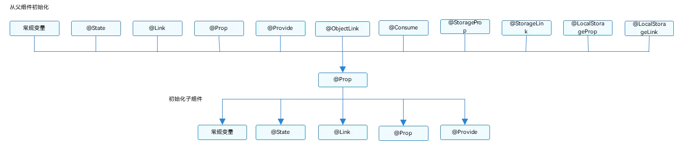
初始化规则图示
下面是单向传递示例代码
- Prop不能赋值
1
2
3
4
5
6
7
8
9
10
11
12
13
14
15
16
17
18
19
20
21
22
23
24
25
26
27
28
29
30
31
32
33
34
35
36
37
38
39
40
41
42
43
44
45
46
47
48
49
50
51
52
53
54
55
56
57
58
59
60
61
@Entry
@Component
struct LearnDetail {
  @State msg: string = "sunyazhou.com"
  build() {
    Row() {
      Column() {
        Text(this.msg).textExtend1(30, Color.Green)
        Button("点击修改传透到子组件",{type: ButtonType.Normal})
          .borderRadius(8)
          .backgroundColor(0x317aff)
          .width(180)
          .height(40)
          .onClick(()=>{
              console.log('点击修改传透到子组件')
              this.msg = this.msg === "sunyazhou.com" ? "迈腾大队长" : "sunyazhou.com"
          })
        LearnDetailProp1({name :this.msg})
      }
      .width('100%')
    }
    .height('100%')
  }
}

// @prop装饰状态数据,方便父与子组件之问进行数据传递与同步 父State--------->prop 单向
@Component
struct LearnDetailProp1 {
  @Prop name: string //Prop不能赋值
  build() {
    Column() {
      Text("www." + this.name).textStyles1()
      Button("单向传递").buttonStyle1(ButtonType.Normal)
        .onClick(()=>{
          this.name = "Prop修饰器修改内容"
        })
    }
  }
}

@Extend(Button) function buttonStyle1 (type :ButtonType) {
  .type(type)
  .borderRadius(8)
  .backgroundColor(0x317aff)
  .width(90)
  .height(40)
}

@Extend(Text) function textStyles1() {
  .textAlign(TextAlign.Center)
  .fontStyle(FontStyle.Italic)
  .decoration({
    type: TextDecorationType.Underline
  })
}

@Extend(Text) function textExtend1(fontSize: number, fontColor: Color) {
  .fontSize(fontSize)
  .fontColor(fontColor)
  .textStyles1()
}

@Link装饰器:父子双向同步
示例代码如果
1
2
3
4
5
6
7
8
9
10
11
12
13
14
// @Link装饰状态数据,方便父与子组件之问进行数据传递与同步 父State <--------->prop 双向传递
@Component
struct  LearnDetailLink1 {
  @Link lineName: string //@Link不能赋值
  build() {
    Column() {
      Text("Link数据:" + this.lineName).textStyles1()
      Button("双向传递").buttonStyle1(ButtonType.Normal)
        .onClick(()=> {
            this.lineName = "被修改的 Link数据"
        })
    }
  }
}
效果展示

基于上述@Prop代码完整展示
1
2
3
4
5
6
7
8
9
10
11
12
13
14
15
16
17
18
19
20
21
22
23
24
25
26
27
28
29
30
31
32
33
34
35
36
37
38
39
40
41
42
43
44
45
46
47
48
49
50
51
52
53
54
55
56
57
58
59
60
61
62
63
64
65
66
67
68
69
70
71
72
73
74
75
76
77
@Entry
@Component
struct LearnDetail {
  @State msg: string = "sunyazhou.com"
  build() {
    Row() {
      Column() {
        Text(this.msg).textExtend1(30, Color.Green)
        Button("点击修改传透到子组件",{type: ButtonType.Normal})
          .borderRadius(8)
          .backgroundColor(0x317aff)
          .width(180)
          .height(40)
          .onClick(()=>{
              console.log('点击修改传透到子组件')
              this.msg = this.msg === "sunyazhou.com" ? "迈腾大队长" : "sunyazhou.com"
          })
        Divider()
        LearnDetailProp1({name :this.msg})
        Divider()
        LearnDetailLink1({lineName :this.msg})
      }
      .width('100%')
    }
    .height('100%')
  }
}

@Component
struct LearnDetailProp1 {
  @Prop name: string //Prop不能赋值
  build() {
    Column() {
      Text("www." + this.name).textStyles1()
      Button("单向传递").buttonStyle1(ButtonType.Normal)
        .onClick(()=>{
          this.name = "Prop修饰器修改内容"
        })
    }
  }
}
// @Link装饰状态数据,方便父与子组件之问进行数据传递与同步 父State <--------->prop 双向传递
@Component
struct  LearnDetailLink1 {
  @Link lineName: string //@Link不能赋值
  build() {
    Column() {
      Text("Link数据:" + this.lineName).textStyles1()
      Button("双向传递").buttonStyle1(ButtonType.Normal)
        .onClick(()=> {
            this.lineName = "被修改的 Link数据"
        })
    }
  }
}

@Extend(Button) function buttonStyle1 (type :ButtonType) {
  .type(type)
  .borderRadius(8)
  .backgroundColor(0x317aff)
  .width(90)
  .height(40)
}

@Extend(Text) function textStyles1() {
  .textAlign(TextAlign.Center)
  .fontStyle(FontStyle.Italic)
  .decoration({
    type: TextDecorationType.Underline
  })
}

@Extend(Text) function textExtend1(fontSize: number, fontColor: Color) {
  .fontSize(fontSize)
  .fontColor(fontColor)
  .textStyles1()
}
@Provide装饰器和@Consume装饰器:与后代组件双向同步
@Provide和@Consume,应用于与后代组件的双向数据同步,应用于状态数据在多个层级之间传递的场景。不同于上文提到的父子组件之间通过命名参数机制传递,@Provide和@Consume摆脱参数传递机制的束缚,实现跨层级传递。
其中@Provide装饰的变量是在祖先组件中,可以理解为被“提供”给后代的状态变量。@Consume装饰的变量是在后代组件中,去“消费(绑定)”祖先组件提供的变量。
@Provide/@Consume装饰的状态变量有以下特性:
@Provide装饰的状态变量自动对其所有后代组件可用,即该变量被“provide”给他的后代组件。由此可见,@Provide的方便之处在于,开发者不需要多次在组件之间传递变量。
后代通过使用@Consume去获取@Provide提供的变量,建立在@Provide和@Consume之间的双向数据同步,与@State/@Link不同的是,前者可以在多层级的父子组件之间传递。
@Provide和@Consume可以通过相同的变量名或者相同的变量别名绑定,建议类型相同,否则会发生类型隐式转换,从而导致应用行为异常。
1
2
3
4
5
6
7
// 通过相同的变量名绑定
@Provide a: number = 0;
@Consume a: number;

// 通过相同的变量别名绑定
@Provide('a') b: number = 0;
@Consume('a') c: number;
显然这修饰器是统一标识 类型一直 根据文档说明如下
| @Provide变量装饰器 | 说明 |
|---|---|
| 装饰器参数 | 别名:常量字符串,可选。如果指定了别名,则通过别名来绑定变量;如果未指定别名,则通过变量名绑定变量。 |
| 同步类型 | 双向同步。从@Provide变量到所有@Consume变量以及相反的方向的数据同步。双向同步的操作与@State和@Link的组合相同。 |
… 更多内容请参照官方文档官网文档
1
2
3
4
5
6
7
8
9
10
11
12
13
14
15
16
17
18
19
20
21
22
23
24
25
26
27
28
29
30
31
32
33
34
35
36
37
38
39
40
41
42
43
44
45
46
47
48
49
50
51
52
@Entry
@Component
struct ProvideConsumeDemo {
  @Provide("com.sunyazhou.message.provide_consume") message: string = "sunyazhou.com"
  build() {
    Row() {
      Column() {
        Text(this.message).textExtend2(30, Color.Black)
          .onClick( ()=> {
            this.message = this.message === "迈腾大队长"? "sunyazhou.com": "迈腾大队长"
          })
        Divider()
        //... 假设这里中间有 100层Component创建和使用
        ProvideConsumeDemo2()
      }
      .width('100%')
    }
    .height('100%')
  }
}

@Component
struct  ProvideConsumeDemo2 {
  @Consume("com.sunyazhou.message.provide_consume") info: string //和之前介绍的@Prop @Link一样 consume不能赋值
  build() {
    Column() {
      Text(this.info).textExtend2(45, Color.Green)
    }
  }
}

@Extend(Button) function buttonStyle2 (type :ButtonType) {
  .type(type)
  .borderRadius(8)
  .backgroundColor(0x317aff)
  .width(90)
  .height(40)
}

@Extend(Text) function textStyles2() {
  .textAlign(TextAlign.Center)
  .fontStyle(FontStyle.Italic)
  .decoration({
    type: TextDecorationType.Underline
  })
}

@Extend(Text) function textExtend2(fontSize: number, fontColor: Color) {
  .fontSize(fontSize)
  .fontColor(fontColor)
  .textStyles2()
效果如下:

@Watch修饰器 用于监听状态变量更改通知
@Watch应用于对状态变量的监听。如果开发者需要关注某个状态变量的值是否改变,可以使用@Watch为状态变量设置回调函数。
1
2
3
4
@State @Watch("didMessageChanged") num1: number = 10;
didMessageChanged () {  //此方法被触发,代表其它地方修改了 @Watch 修饰的变量
	console.log("监听到消息发生变化:" + this.num1)
}
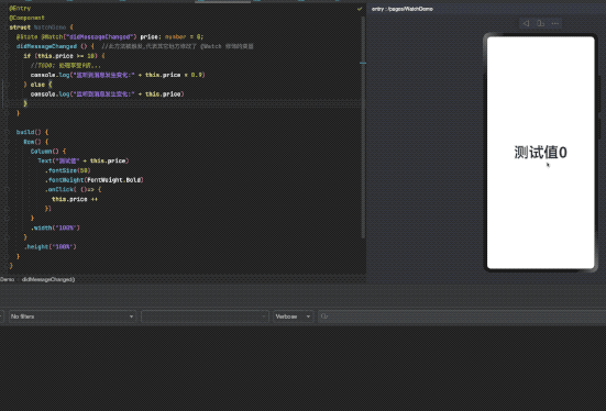
完整示例代码
1
2
3
4
5
6
7
8
9
10
11
12
13
14
15
16
17
18
19
20
21
22
23
24
25
26
27
28
29
@Entry
@Component
struct WatchDemo {
  @State @Watch("didMessageChanged") price: number = 0;
  didMessageChanged () {  //此方法被触发,代表其它地方修改了 @Watch 修饰的变量
    if (this.price >= 10) {
      //TODO: 处理享受9折...
      console.log("监听到消息发生变化:" + this.price * 0.9)
    } else {
      console.log("监听到消息发生变化:" + this.price)
    }

  }

  build() {
    Row() {
      Column() {
        Text("测试值" + this.price)
          .fontSize(50)
          .fontWeight(FontWeight.Bold)
          .onClick( ()=> {
            this.price ++
          })
      }
      .width('100%')
    }
    .height('100%')
  }
}
ForEach:循环渲染
假设我们要做一个像iOS中的UITableView列表我们可以使用ArkUI中的ForEach
1
2
3
4
5
6
7
8
9
10
11
12
13
14
15
16
17
18
19
20
21
22
23
24
25
26
27
28
@Entry
@Component
struct ForEachDemo {
  @State message: string = 'sunyazhou.com';
  @State tags: Array<string> = ['Algorithm29','ArkTS1','AVFoundation15','AVKit1','C++19','Cocoapods5','Dart2','Git3','HarmonyOS3','iOS119','...']

  build() {
    Row() {
      Column() {
        Text(this.message)
          .fontSize(38)
          .fontWeight(FontWeight.Bold)
        Divider()
        ForEach(this.tags, (tag : string) => {
            Text("Blog tag has "+ tag)
              .textAlign(TextAlign.Start)
              .fontSize(18)
              .width('80%')
              .backgroundColor('#00E5EE')
        }, (tag: string)=>{
          return tag
        })
      }
      .width('100%')
    }
    .height('100%')
  }
}

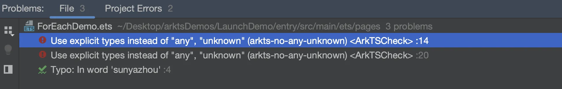
这里有个坑, ForEach(this.tags, (tag : string这里必须标注类型在Harmonry4.1中) => {}
如果不标注类型就容易报错
1
Use explicit types instead of "any", "unknown" (arkts-no-any-unknown) <ArkTSCheck>
组件通用特性-点击事件
我们可以通过点击事件对象拿到相应的位置信息.
1
2
3
4
5
6
7
8
9
10
11
12
13
14
15
16
17
18
@Entry
@Component
struct UniversalEventDemo {
@State message: string = 'https://www.sunyazhou.com/';
//TODO 所有的 组件 的 通用特性之 事件系
build() {
Column(){
Row() {
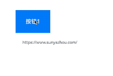
Button('按钮1', {type: ButtonType.Normal}).width('100').height('66')
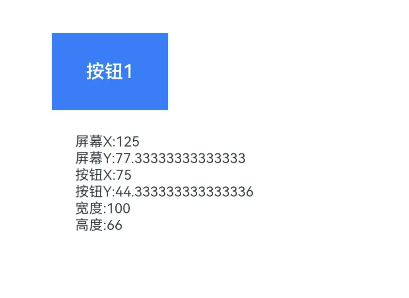
.onClick((event: ClickEvent) => {
this.message =
`屏幕X:${event.windowX} \n屏幕Y:${event.windowY} \n按钮X:${event.x} \n按钮Y:${event.y} \n宽度:${event.target.area.width} \n高度:${event.target.area.height}`
})
}
Text(this.message).margin(20).fontSize(12)
}.height('100%').alignItems(HorizontalAlign.Start).padding({top: 33, left: 50})
}
}
ClickEvent 类可以拿到如下各种变量
组件通用特性-触摸事件
1
2
3
4
5
6
7
8
9
10
11
12
13
14
15
16
17
18
19
20
21
22
23
24
25
26
27
28
29
30
@Entry
@Component
struct UniversalEventDemo {
  @State message: string = 'https://www.sunyazhou.com/';
  @State eventType :string = ''
  build() {
    Column(){
      Row() {
        Button('按钮1', {type: ButtonType.Normal}).width('100').height('66')
          .onTouch((event: TouchEvent)=> {
            if (event.type == TouchType.Down) {
              this.eventType = '按下-Down'
            }
            if (event.type == TouchType.Up) {
              this.eventType = '抬起-Up'
            }
            if (event.type == TouchType.Move) {
              this.eventType = '触摸中-Move'
            }
            this.message = '触摸类型:'+ this.eventType + '\n' +
              'x:' + event.touches[0].x + '\n' +
              'y:' + event.touches[0].y + '\n' +
              '宽度:' + event.target.area.width + '\n'
              '高度:' + event.target.area.height + '\n'
          })
      }
      Text(this.message).margin(20).fontSize(12)
    }.height('100%').alignItems(HorizontalAlign.Start).padding({top: 33, left: 50})
  }
}
组件通用的尺寸排版学习
1
2
3
4
5
6
7
8
9
10
11
12
13
14
15
16
17
18
19
20
21
22
23
24
25
26
27
28
29
30
31
32
33
34
35
36
37
38
39
40
41
42
43
44
@Entry
@Component
struct LayoutDemo {
build() {
Column() {
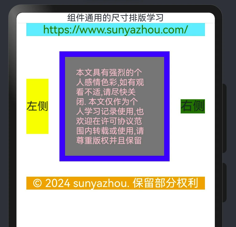
Text('组件通用的尺寸排版学习')
Divider()
Row() {
Text('https://www.sunyazhou.com/').fontSize(20).fontColor(Color.Green).width('90%')
.textAlign(TextAlign.Center)
}
.backgroundColor("#00F5FF")
Row(){
Text('左侧').fontSize(20).backgroundColor(Color.Yellow).height(100)
Row() {
Row() {
Text('本文具有强烈的个人感情色彩,如有观看不适,请尽快关闭. ' +
'本文仅作为个人学习记录使用,也欢迎在许可协议范围内转载或使用,' +
'请尊重版权并且保留原文链接,谢谢您的理解合作.' +
' 如果您觉得本站对您能有帮助,您可以使用RSS方式订阅本站,' +
'这样您将能在第一时间获取本站信息.')
.fontSize(15)
.fontColor(Color.Pink)
.width('90%')
}
}
.width(200)
.height(200)
.backgroundColor(Color.Gray)
.padding(20) //外边距
.margin({top: 28, bottom: 28, left:20, right:20}) //内边距
.border({width: 10, color: Color.Blue}) //内部边框
Text('右侧').fontSize(22).backgroundColor(Color.Red).backgroundColor(Color.Green)
}
Row() {
Text('© 2024 sunyazhou. 保留部分权利').fontSize(20).fontColor(Color.White).width('90%')
.textAlign(TextAlign.Center)
}
.backgroundColor(Color.Orange)
}
.backgroundColor(Color.Transparent)
}
}
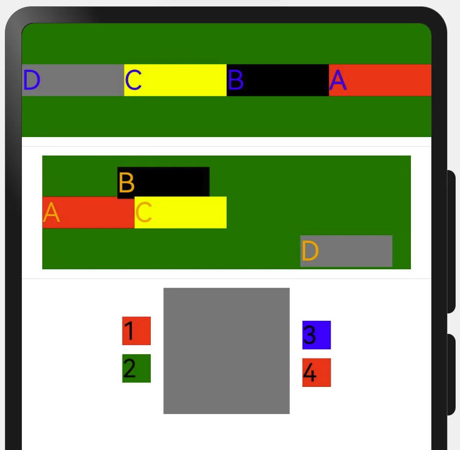
position和markAnchor,以及offset的使用如下.
1
2
3
4
5
6
7
8
9
10
11
12
13
14
15
16
17
18
19
20
21
22
23
24
25
26
27
28
29
30
31
32
33
34
35
36
37
38
39
40
41
42
43
44
45
46
47
48
49
@Entry
@Component
struct LayoutDemo2 {
build() {
Column({space:8}) { //
Row() {
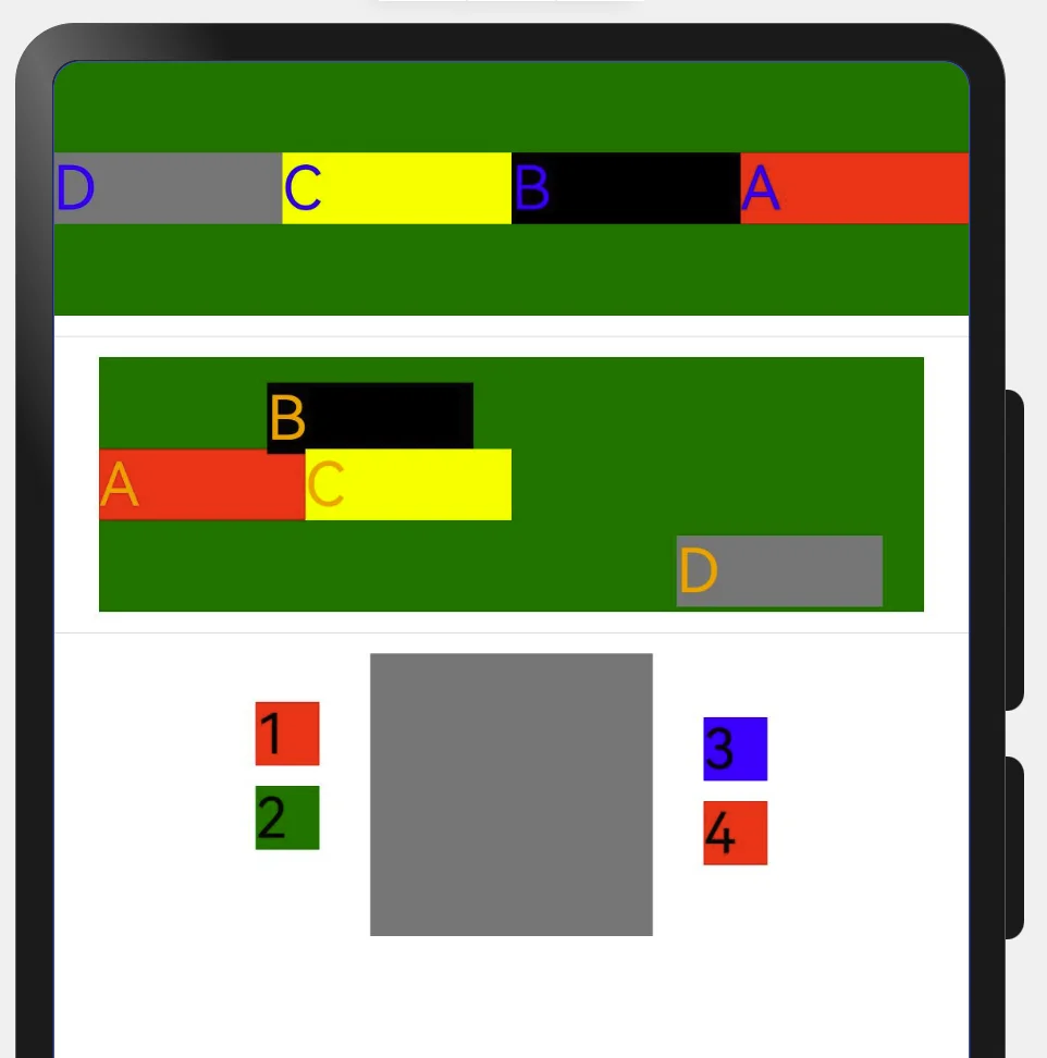
Text('A').fontSize(24).fontColor(Color.Blue).width('25%').backgroundColor(Color.Red)
Text('B').fontSize(24).fontColor(Color.Blue).width('25%').backgroundColor(Color.Black)
Text('C').fontSize(24).fontColor(Color.Blue).width('25%').backgroundColor(Color.Yellow)
Text('D').fontSize(24).fontColor(Color.Blue).width('25%').backgroundColor(Color.Grey)
}
.backgroundColor(Color.Green)
.width('100%')
.height(100)
.direction(Direction.Rtl)
Divider()
Column({space: 8}) {
Row() {
Text('A').fontSize(24).fontColor(Color.Orange).width('25%').backgroundColor(Color.Red)
Text('B').fontSize(24).fontColor(Color.Orange).width('25%').backgroundColor(Color.Black)
.position({x: 66, y: 10}) //这种指定x y 适配性较差
Text('C').fontSize(24).fontColor(Color.Orange).width('25%').backgroundColor(Color.Yellow)
Text('D').fontSize(24).fontColor(Color.Orange).width('25%').backgroundColor(Color.Grey)
.position({x: '70%',y: '70%'}) //推荐方式适配性比较好
}
.backgroundColor(Color.Green)
.width('90%')
.height(100)
.direction(Direction.Ltr)
}
Divider()
//当前 mark 默认: .markAnchor({x: 0, y: 0})
Column({ space: 8}) {
Stack() {
Row().width(111).height(111).backgroundColor(Color.Grey)
}
Text("100").fontSize(22).fontColor(Color.Black).width('25').height(25).backgroundColor(Color.Red)
.markAnchor({x: 88, y: 100}) //自己当前值 + x 80, y 100.
Text("200").fontSize(22).fontColor(Color.Black).width('25').height(25).backgroundColor(Color.Green)
.markAnchor({x: 88, y: 100}) //自己当前值 + x 80, y 100.
Text("300").fontSize(22).fontColor(Color.Black).width('25').height(25).backgroundColor(Color.Blue)
.markAnchor({x: -88, y: 160})
Text("400").fontSize(22).fontColor(Color.Black).width('25').height(25).backgroundColor(Color.Red)
.markAnchor({x: -88, y: 160})
}
}
}
}
1
2
3
4
5
6
7
8
9
10
11
12
13
14
//当前 offset
Column({ space: 8}) {
  Stack() {
    Row().width(111).height(111).backgroundColor(Color.Grey)
  }
  Text("100").fontSize(22).fontColor(Color.Black).width('25').height(25).backgroundColor(Color.Red)
    .offset({x: '-22%', y: '-12%'}) //自己当前值 + x值%, y值%.
  Text("200").fontSize(22).fontColor(Color.Black).width('25').height(25).backgroundColor(Color.Green)
    .offset({x: '-22%', y: '-12%'}) //自己当前值 + x值%, y值%.
  Text("300").fontSize(22).fontColor(Color.Black).width('25').height(25).backgroundColor(Color.Blue)
    .offset({x: '22%', y: '-20%'}) //自己当前值 + x值%, y值%.
  Text("400").fontSize(22).fontColor(Color.Black).width('25').height(25).backgroundColor(Color.Red)
    .offset({x: '22%', y: '-20%'}) //自己当前值 + x值%, y值%.
}
组件的对齐方式
两者一致的特点(特点: 从外到内的获取宽高)
Column 主轴方向↓, 交叉轴→ justifyContent 垂直 Row 主轴方向→, 交叉轴↓ justifycontent 水平
Flex可自主选择水平和垂直布局容器
- direction: FlexDirection.Column 纵向
- direction: FlexDirection.Row 横向
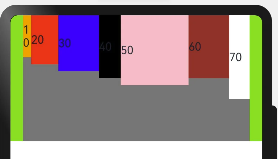
1
2
3
4
5
6
7
8
9
10
11
12
13
14
15
16
17
18
19
20
21
22
23
24
25
26
27
28
@Entry
@Component
struct FlexPage {
  build() {
    Column({space: 20}) {
      Flex({
        direction: FlexDirection.Row, //这里Row和Column自主选择
        justifyContent: FlexAlign.SpaceEvenly, //主轴方向 .Column垂直 .Row水平
        alignItems: ItemAlign.Start, //交叉轴方向 .Cotumn 左边开始 右边开始 .Row
        //wrap: FlexWrap.Wrap //换行
        wrap: FlexWrap.NoWrap //不换行
      }) {
        Text("10").width('6%').height(60).backgroundColor(Color.Orange)
        Text("20").width('20%').height(70).backgroundColor(Color.Red)
        Text("30").width('30%').height(80).backgroundColor(Color.Blue)
        Text("40").width('16%').height(90).backgroundColor(Color.Black)
        Text("50").width('50%').height(100).backgroundColor(Color.Pink)
        Text("60").width('30%').height(90).backgroundColor(Color.Brown)
        Text("70").width('15%').height(120).backgroundColor(Color.White)
      }
      .height(180)
      .width('90%')
      .backgroundColor(Color.Gray)
    }
    .backgroundColor('#ff8ce53d')
    .width('100%')
  }
}
下面是Column的对齐方向
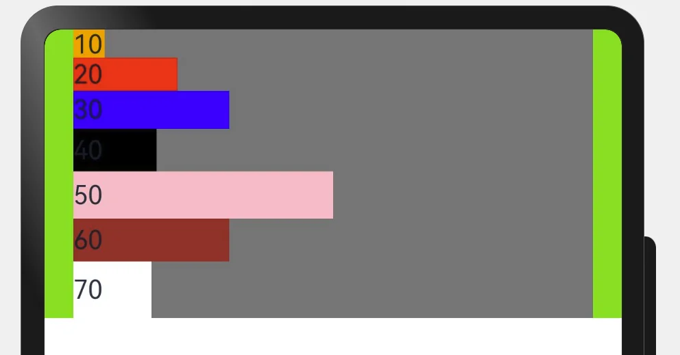
下面是Row的对齐方向
总结
随时积累记录